Choosing Paint Colours for Feature Walls in West Yorkshire Homes
Choosing paint colours for a feature wall in West Yorkshire? Our guide covers tone, light, finish and proportion to help you get it right first time.

Choosing a paint colour for a feature wall in West Yorkshire
A feature wall lives or dies by one decision: the colour. Get it right and the room feels considered and complete. Get it wrong and even a carefully painted finish can look like an afterthought. There is a method to choosing well, and once you understand the principles the decision becomes much clearer.
This guide walks through how to approach feature wall colour, from reading the light in a room to understanding how finish affects tone. Whether you are planning a panelled feature wall or a single painted accent wall, the colour decision is where everything starts. Exquisite Detail Decorating Services offers premium painting, decorating and bespoke interior finishes across West Yorkshire and surrounding areas.
Start with the light in the room
Light is the biggest variable in any colour decision. A colour that looks warm and rich on a showroom card can read as cold and flat on your wall.
Before picking up a colour card, spend a day noticing how the light moves through the room. A north-facing room receives cooler, bluer light, so warm tones such as ochres, terracottas and olive greens can work well to balance it. South-facing rooms get warmer, golden light, which gives you more flexibility. East-facing rooms are bright in the morning and dimmer later, and west-facing rooms are the reverse.
Understand undertones
Every paint colour has an undertone. A grey that looks neutral on the card can pull blue or green on the wall, and a white can read yellow or pink in certain light.
- Cool undertones (blue, green, grey) tend to recede and can suit smaller rooms.
- Warm undertones (red, yellow, orange) tend to advance and can create intimacy in larger spaces.
- Neutral undertones are harder to find than they look, so test them in your own light.
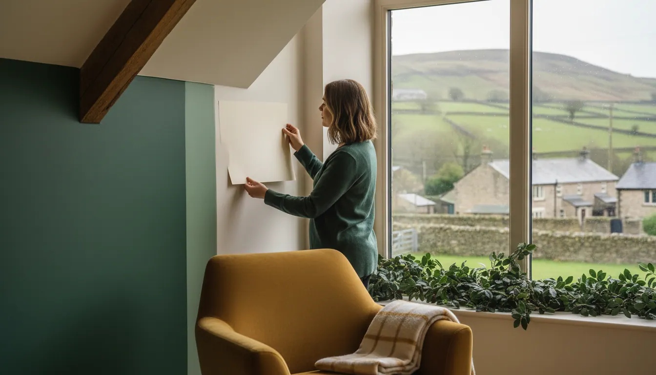
Always test on the actual wall, not on card held up to it. Paint a large patch and look at it at different times of day and under artificial light.
Which wall to feature
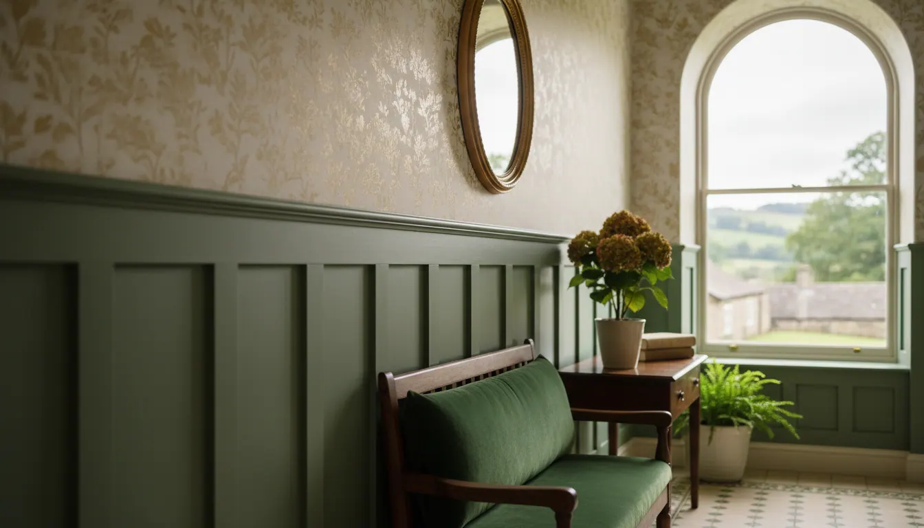
The most common choice is the wall the eye naturally travels to when you enter a room: the wall behind the bed in a bedroom, or the fireplace wall or the wall opposite the main window in a living room. Avoid featuring a wall that cuts awkwardly across an architectural element. A panelled feature wall can work especially well, because the structure of the panelling creates its own visual weight. See our wall panelling ideas for hallways for inspiration.
How dark is too dark?
Deep, saturated colours such as inky blues, forest greens and charcoal create drama, but they need handling carefully.
- Room size and ceiling height. A very dark colour in a small room with a low ceiling can feel oppressive. A mid-tone may be a better choice.
- Contrast with the rest of the room. The feature wall works through contrast. If the other walls are already mid-tone, a dark feature can feel heavy.
- The finish. A matt finish absorbs light and makes a dark colour feel richer, while a satin finish reflects more light and feels slightly more energetic.
Finish matters as much as colour
The same shade in a dead flat matt and a mid-sheen satin can look like two different colours.
- Matt emulsions suit a deep, rich, absorbed look but show brush marks and texture more, so preparation and application need to be precise.
- Satin and eggshell finishes are often more practical in hallways and busy rooms because they are more wipeable.
- Gloss is rarely right for a full feature wall but can work on panelling details and woodwork.
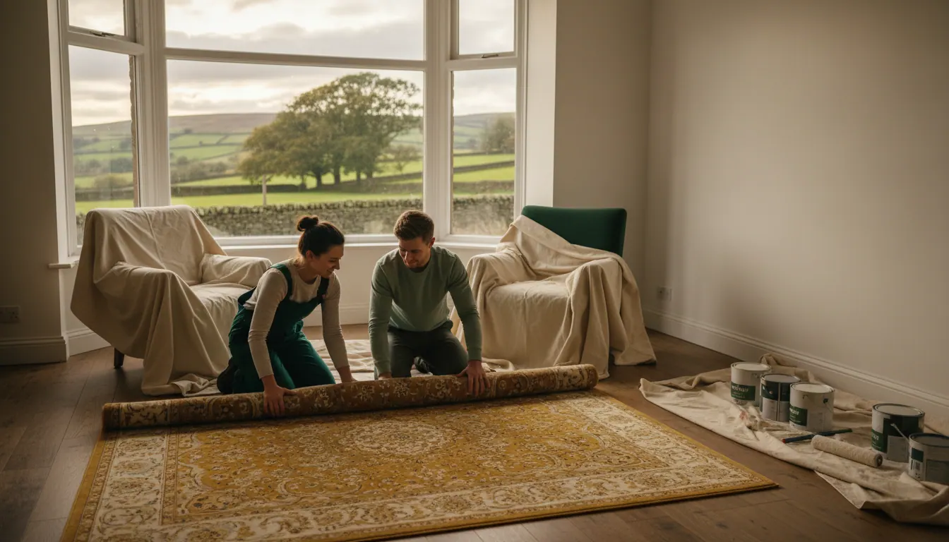
A beautifully chosen colour applied poorly, with visible roller lines or uneven sheen, loses most of its impact. Good preparation helps, so see our guide to preparing a room for decorating.
Warm neutrals and earthy tones
Warm whites, soft stone tones, dusty pinks, olive greens and warm taupes are often safe choices for a feature colour, as they feel grounded and coherent in many homes. Deep navy, forest green and charcoal suit a more dramatic effect. Cooler greys and stark whites can work but often need warmer accents to avoid feeling clinical.
Frequently asked questions
How do I know if a colour will work before I commit? Test it properly. Paint a large section directly onto the wall and look at it in the morning, at midday and in the evening under artificial light.
Should the feature wall be darker or lighter than the other walls? Usually darker, because the contrast is what makes it a feature. A lighter feature wall can work in a very dark room to create a bright focal point.
What finish should I use in a hallway? Hallways get a lot of contact, so a mid-sheen finish such as satin or eggshell is often more practical than dead flat matt. If you have panelling, you could use satin on the panels and a flatter finish above.
Does feature wall colour change how large the room feels? Yes. Dark colours make a wall feel closer and the room more intimate, while lighter or cooler colours create a sense of distance.
Ready to plan your feature wall in West Yorkshire?
If you would like help with a feature wall, panelling or a bespoke finish, call 07818 234913 or get in touch via the contact form to talk through what you have in mind and arrange a quote. You can also read about our decorative features and installations.